
Behind the Design: Pleasant Ridge Nursery
A peek into creating a colorful, shared bedroom for a toddler and newborn
My client came to me 7 months pregnant with a direct and immediate need: she was expecting a new baby boy in a couple of short months, and her toddler daughter’s bedroom needed to be redesigned to accommodate the little one’s arrival. We connected right away - and it wasn’t so much that she won me over by saying “I cannot see my f*cking feet and I cannot make complicated design decisions”… although, that will always be one of the best introductions.
The project was intriguing because I grew up sharing a room with my baby sister (7yrs younger than me), and I remember what it felt like to cohabitate. Her teething rings next to my Lisa Frank journals. Her drool bibs next to my training bras (they still fit). And even though this is not a 1:1 with what my client was facing, I still appreciate firsthand how important it is to hold space for each child’s unique personality - especially when they’re sharing a bedroom.
Okay. Enough gabbing from me. Let’s take the full tour.
The Brief
TIMING: client was 7 months pregnant - so our timeline was SHORT! This meant we needed items in stock and we needed to keep design changes on the smaller side.
DESIGN NEEDS: nursery needed to be gender neutral as it was going to be a shared space - she already had a sweet toddler chick, and was welcoming her first baby boy. She also wanted it to feel bright, inspiring, colorful and playful.
FUNCTIONALITY: it needed to fit a crib, toddler bed, include additional storage for clothes, and had to have full-blackout window treatments.
The Design Direction
Nurseries/children’s rooms can be tricky. There’s a fine line between plastering unicorns everywhere to appeal to a current obsession, versus creating a space that doesn’t feel in tune with the small imaginative little people living in the space. My rule of thumb…. there are no thumbs. But as a general jumping off point for this space, I figured it was best to play with color as the base and then introduce more pattern and play through decor - the latter is interchangeable and can be updated with the child’s latest interests (versus needing to redo the space each time they hit a new milestone).
KEPT FURNISHINGS:
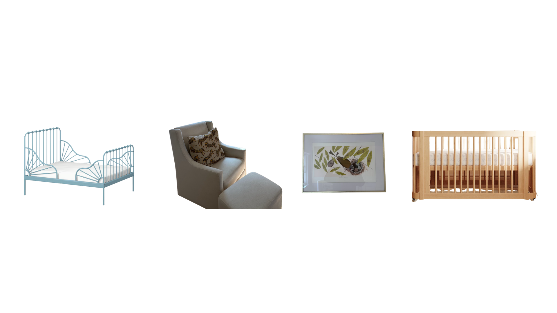
A scallop toddler bed, a rocking chair (with a badass tiger pillow), a framed Charley Harper print, and a crib needed to be incorporated into the new design.

MOOD BOARD SNAPSHOT:
A warm powder blue is one of my all-time favorite colors - and it worked so wonderfully in here. It defies any gender stereotypes and provides a wonderfully soft base to build on top of with a funky mustard-colored, gingham canopy, floral sheets, and the cutest and punchiest of gallery walls.
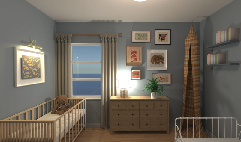
RENDERING SNAPSHOT:
There were two orientations that could’ve worked in here, but this one in particular made the most sense when it came to allowing the room to breathe. Instead of trying to fill up every inch of a space with “something”, we left the center of the room as an open area for the kids to play.
I’m going to be honest. Very rarely do I pitch creative on a project and have a client say “yes, that’s it”. There’s usually more back and forth, a couple color revisions, maybe they don’t like a certain chair or rug that was picked out. Which is all fine and normal and part of the collaborative process!
This situation was different….. and it was so great. It might’ve been because we both love Beyonce to an unhealthy degree. Maybe it’s because I felt very empathetic to her situation as I had just had my second child and just getting past the point of having to wear diapers myself. Who knows. Regardless of the why, it was a magical collaboration.
The Before


The After


The Design Details
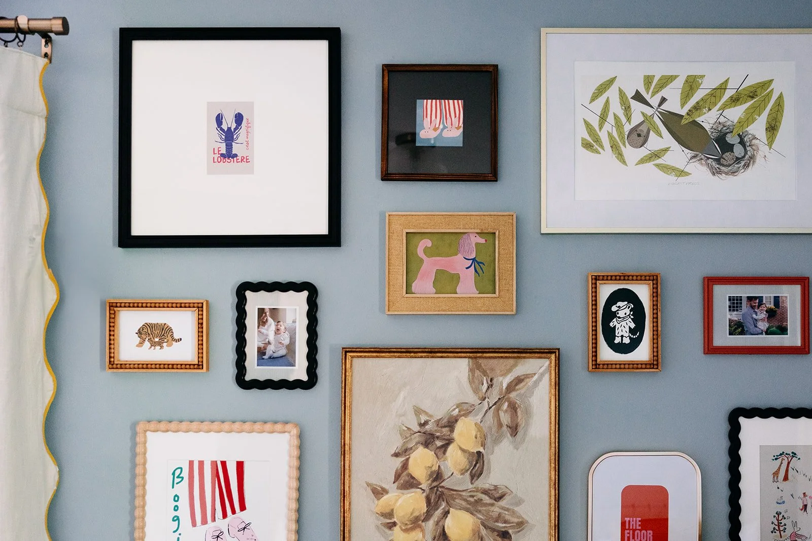
Reoccurring Color Themes: this space tied together so neatly because there were two primary color themes that were repeated throughout. There was the powder blue (found in the bed, the wall color, and the artwork) and mustard yellow (found in the canopy, the curtain trim, the bedding, the throw pillows, and the artwork). I’m not always a crazy stickler about repetitive hues, but for this project, it just made sense to establish a theme.
Artwork: it might sound corny, but as a kid, I distinctly remember what hung on my walls and it genuinely helped shape my appreciation for art. That’s probably why I’m so invested in what people are hanging up in their homes - especially in kids rooms! For this gallery wall, we combined a fun array of animal and text prints, a loved Charley Harper piece, and small snapshots of their family with a fun striped matting.
Fabric Letters: when you run out of art you want to hang on the walls - go a different textile direction, like patterned letters! Fun tidbit, we shot this project so close to my client’s due date that they had still not picked out a name for him… so we couldn’t order the fabric letter for above his crib by the time the photoshoot wrapped. Rest assured, he has a name now :)
Where To Purchase
Links to products used on this project… and nope, I don’t get commission from these. Just wanted to spread the design love :)


